

JT Percy PEACE
Peace 2
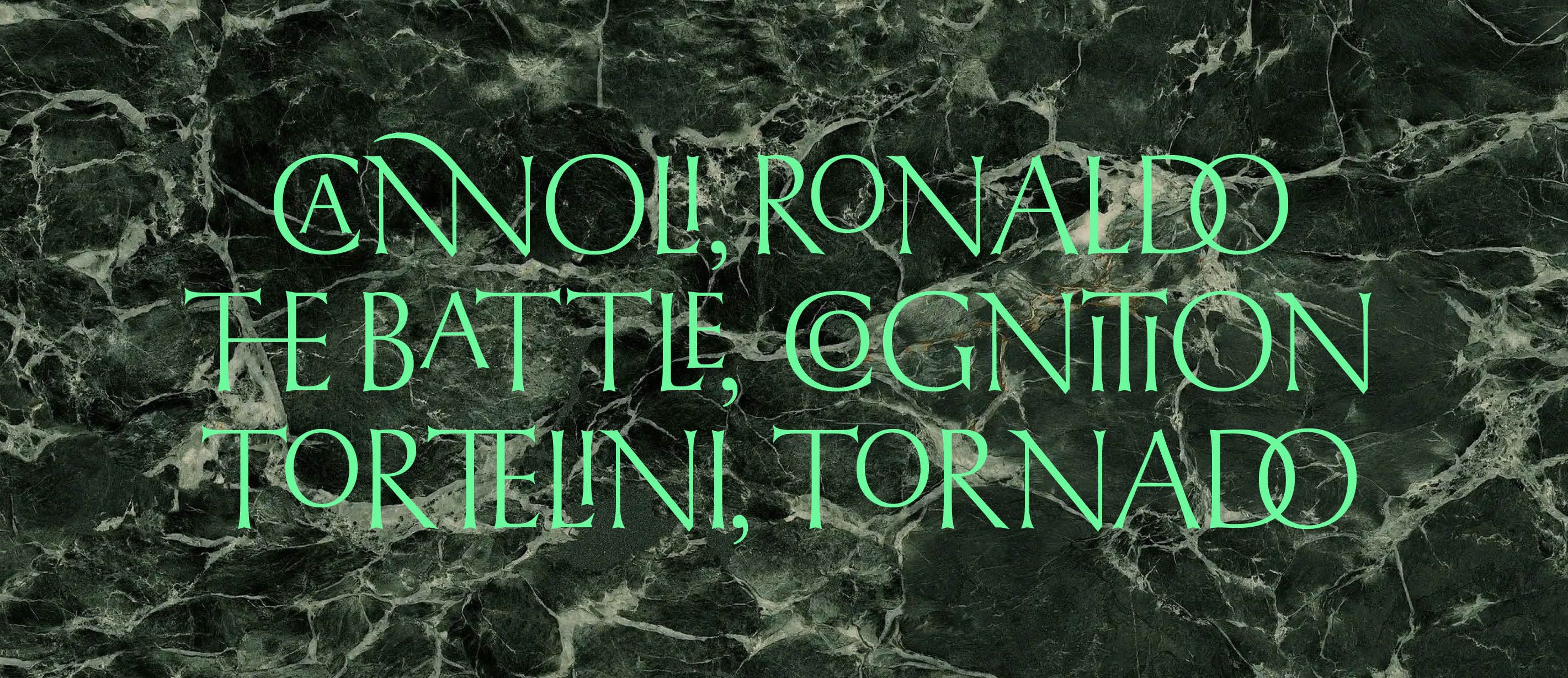
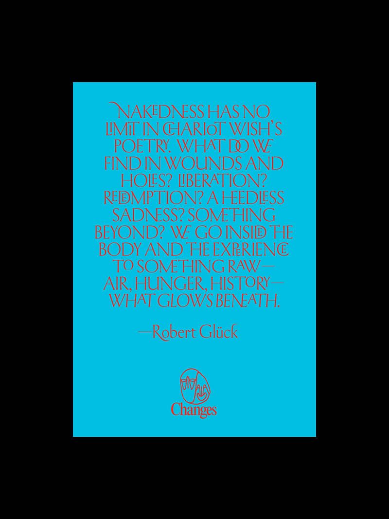
The development of the typeface began with the study of stone-carved letterforms, shaped by archival research and visits to historical cemeteries. Early inspiration came from the inscriptions at the Royal Institute of British Architects, crafted by Percy John Delf Smith, a student and later assistant of the legendary Edward Johnston. The flowing swashes, inscriptional quality, and expressive lowercase r stood out and inspired the early sketches of the typeface. The uppercase propotrtions are rooted in second-century incised inscriptions, while the lowercase reflects nuances from Renaissance-era letterforms, creating a balance between classical structure and humanist detail. One of the standout features of JT Percy is its extensive range of ligatures and swashes. Designed to give you the freedom to experiment, and countless possibilities for expressive and original typographic compositions. We can’t wait to see how designers will use them!
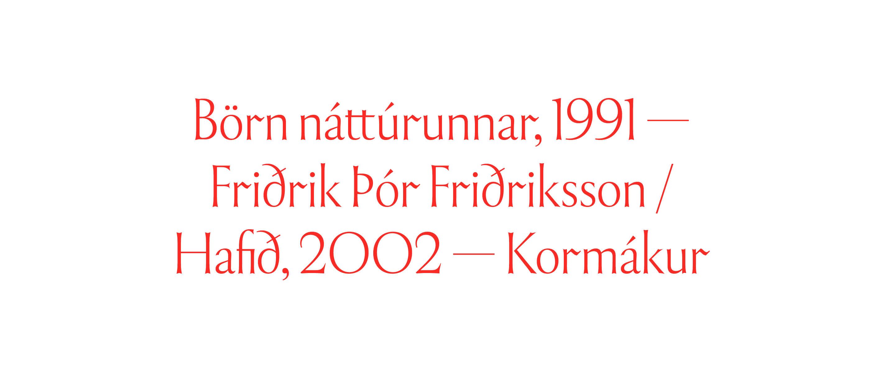
JT Percy also comes with full Cyrillic support. This part of the project was developed in close collaboration with Bulgarian designer Pavel Pavlov, and further refined with insights from our talented Ukrainian intern at the time, Lev Rastvorsev. Through ongoing dialogue, we ensured that the Cyrillic character set resonates with the spirit of the Latin forms, both in tone and typographic voice. Nika Langosz worked her magic on expanding swashes and kerning, while Rafał Buchner wrapped up the engineering side. JT Percy is designed with expansion in mind, and we plan to release serif version and additional weights in the near future.
excl. BTW